DESIGN
Logos are one of my favourite kinds of projects as I get to connect and empathise with a diverse range of people, places and causes, understanding their mission and identity in the wider scheme of their market to create an icon that will stand out from the rest and tell their highly personalised story.
BRAND IDENTITY: SOLARPUNK
My logo design for Solarpunk Aotearoa symbolizes positivity, people and purpose, it was created from a deep process of reflection between myself and the instigator of the Aotearoa Solarpunk movement. I incorporated her chosen iconography of stars, navigation, Fibonacci and koru.
BRAND IDENTITY: KATE POWELL, COMMS WRITER
A very candid consultation and exploration into the diversity of Kate’s work allowed me to produce a highly personalised card. I created a vector portrait of her and an overall design which symbolized her abilities yet was minimalist enough it could be handed to anyone in the various roles of her industry.
BRAND IDENTITY : DEBORAH MACDONALD BROWN, SOLARPUNK
As a personal commission to the leader of my ongoing freelance position with Solarpunk Aotearoa I created a bee motif which leaned into her personal aesthetic of antiquity, art and influences of nature. It is designed to represent her eclectic and radical leadership style with maturity and professionalism.
SOLARPUNK WEBSITE
The goal of the website is to reframe yearly festivals with high ticket prices as an
open-source, free or low-cost ongoing celebration and support of events within the Solarpunk Aotearoa community.
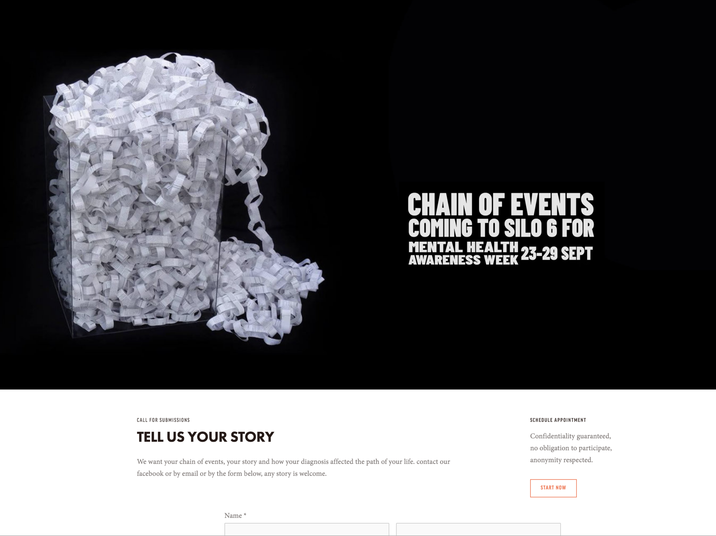
CHAIN OF EVENTS WEBSITE
The Chain Of Events website is designed to keep growing, it lists the events and places the chain installation has been hosted at, and has begun other projects such as a call for submissions of lived experiences during lockdown.
The Silo 6 event also had an accompanying facebook page for marketing.
SOLARPUNK SOCIAL MEDIA / MARKETING
Using the Solarpunk Aotearoa branding as a catalyst, I created a colour and typographical theme that could be spun a few different ways to create consistent, clear and vibrant media, much of which has jumped between print and digital display as needed.
This is ongoing work.
BATTLEFRONT MINIATURES
My time at battlefront was spent on high-detail product photography of the miniatures, editing book pages and game-play cards, creating posters, web ads and banners, packaging ranges and instruction guides. I was credited in 15+ titles during my time there (Some will have been published after I left.)
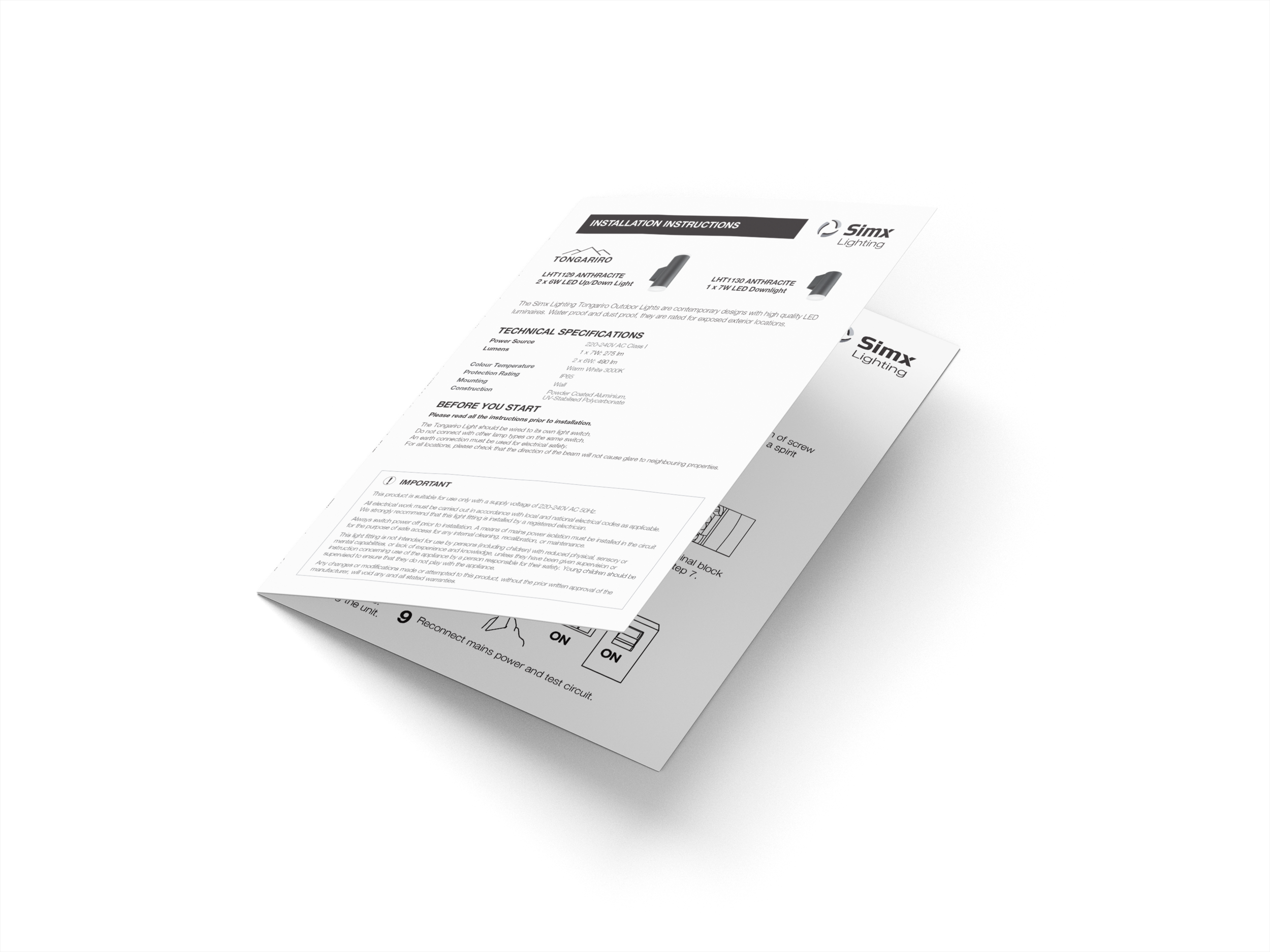
SIMX LTD / VOLUTION GROUP PTY
A highlight project of my time at Simx as an in-house graphic designer was to design a style for a new lighting range to elevate its high quality construction and its sleek, contemporary contours and lighting effects. This included the product guide, packaging and instructional designs.
WOODLAND’S PERK COFFEE BRAND AND SIGNAGE
This branding synthesizes the trees of West Auckland bush suburb Woodlands Park, and was inspired by the clean
minimalist style of the existing Kokako coffee brand into a logo that could be adapted for signage and coffee cards.
DUCHESS H GIN SPECIAL EDITION LABEL
I was given a wonderful project by a fellow lady craftsperson, the task of designing all elements of the Label for her 2024 Winter limited edition Gin Liqueur. Rich decacence was the goal here, along with the same sense of delicacy and class as her other editions have held, we hope to collaborate on future tasty projects! A particularly lovely touch for a client of note, the wonderful distiller encouraged me to put my own logo on the bottle as a credit to the collaboration.


